Summary
This article showcases mortgage websites that stand out due to their design, functionality, and user experience. It explores features like mobile optimization, intuitive navigation, and compelling calls to action that drive conversions. By examining these examples, professionals can gain inspiration to improve their online presence and attract more clients.
We’ve been covering a lot of topics around best practices in mortgage websites, features you need to include in your site, and what makes a great mortgage website. Let’s look at examples of 3 great mortgage websites we like. It’s important to understand that there is no perfect mortgage brokerage website. No matter how great a site is, there is always room for improvement. With that in mind, we are going to lay out our favorite sites and share with you what we think they did right, and also what could use some improvement.
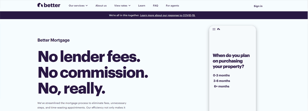
Better.com has one of the more modern websites in the Mortgage Industry. The layout, while minimalist has a wealth of features and information packed into it that helps establish them as the thought leader in potential borrower’s minds.
What They Are Doing Right
Their Website Follows The Hero’s Journey Framework
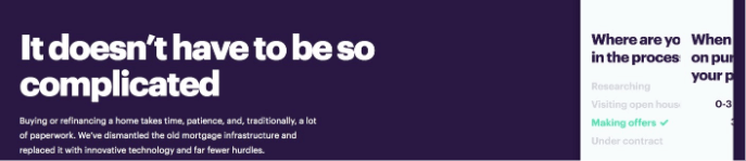
Their website follows the Hero’s Journey framework quite well. The site expresses an understanding of their potential client’s needs quite well. Not only that, it also details how they can help them solve these needs and specifically what the potential borrower needs to do to get on their way to solving their need.
They Have Very Easy To Use Preapproval Tool
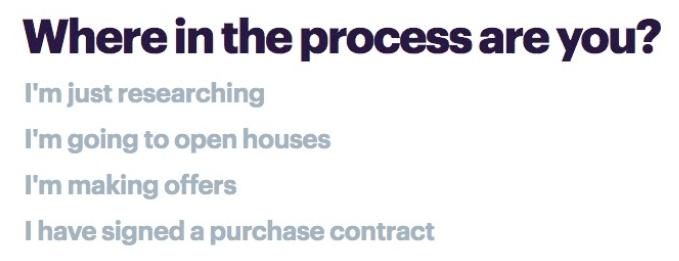
As we mentioned in our previous article <<LINK TO 6 Features Your Website Must Have>> having integrated tools for things like preapprovals and a variety of mortgage calculators is crucial to a mortgage website that is put together well. Better have done this very well, following their clean, minimalist flow throughout their questionnaire. They’ve taken care to only ask a couple of questions on each page of the tool, ensuring that fatigue won’t set in and maximizing the chances of a successful conversion.
They Have A Very Robust Learning Center

Their learning center covers not only current mortgage trends and rates but also answers lots of questions that their potential customers are facing. Giving away all this information on their blog is a fantastic way for Better to establish themselves as a thought leader in the mortgage industry and a trusted source that potential lenders should consider doing business with.
What Could Use Some Work
They Lack A Variety Of Communication Channels
While the Better website is very modern, it lacks a variety of communication options. Chat is available, but it only is accessible when you are actually filling out something like a preapproval questionnaire. Other than that, they are limited to phone and email communication, but that information is not obvious for a website visitor to find.
They Aren’t Fully Utilizing Third Party Verified Reviews
While it is great that Better features their review ratings from Google and Bankrate, they missed out on the opportunity of actually displaying verified reviews from those sites. Writing reviews directly into your mortgage website is better than nothing, but for maximum impact, you want to use a widget from the 3rd party review platforms that show the actual reviews.
They Are Missing Out On Lead Capture Opportunities
Short of the lead capture features in their loan qualification forms, there really are no other lead capture opportunities on this website. With all the great content Better features on their blog, they are really missing out on the opportunity to add lead magnets that are more than simply “see how much home you can afford”.
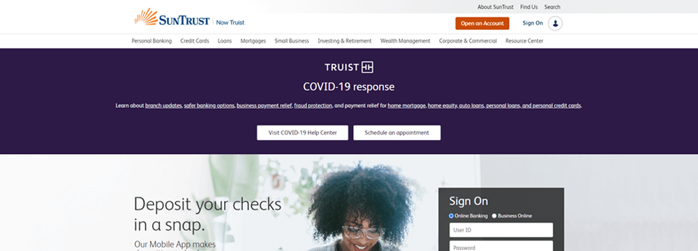
SunTrust, while actually having a broad range of services that they offer to the public, has built out quite a comprehensive list of mortgage services. Even though the site has the look and feel of a “big bank”, they’ve done a good job at approaching potential borrowers in a humanistic approach that makes them seem more like a family and less like a corporation.
What They Are Doing Right
Great Use Of Popups and Sticky Banners

SunTrust has really taken advantage of the best practices for sticky bars and Popups. As we have mentioned in prior articles these items help keep website visitors on the site longer. Not only that, but they’ve also gone the extra mile with a popup that offers people the opportunity to give their impression of their website experience before they leave the site. This offers invaluable insight to the team at SunTrust allowing them to further optimize their site and squeeze out more conversion.
They Have Great Blog Resources

As we’ve talked about over and over in many of our blog articles, the more valuable information you can give people, the higher the chances of becoming a thought leader in your prospective borrower’s minds. SunTrust has done a great job not only offering lots of value-added information to their blog but have also gone the extra step to feature some of their top content right on their homepage, ensuring that website visitors will see it and increasing the likelihood that they will click through this content and read it.
Their Site Has A Wealth Of Integrated Calculators

Everybody of course wants to know what payments a potential loan may hold. SunTrust has not only put together a fantastic calculator tool that integrates nicely and works very quickly on their site, but they have also installed a variety of 5 different calculators that should address just about any borrowing need a potential borrower may have.
What Could Use Some Work
They Lack Communication Options
While SunTrust has done many things right on their website, one thing they seriously have missed best practices on is giving people a way to get in touch with them. Their phone number is buried at the bottom of their website which makes it hard for potential borrowers to find. At the bottom, they also have a link to a help center, but it also lacks things like online chat, support email features, and other features you would generally expect to see in a support center.
Their Preapproval Form Requires You Set Up An Account First
While SunTrust does have a cleanly integrated preapproval form, they are likely missing out on maximum conversion potential because they ask potential borrowers to set up an account first. Asking someone to give their personal information before they’ve been able to see what your preapproval process is all about and getting excited about the potential of the loan you might receive can be seen by many as too much effort to deal with. In many instances, they may just move on to another mortgage broker’s website.
Completely Missing Social Proof
No matter how great of a mortgage service you offer, nothing illustrates that as well as client testimonials. SunTrust does not have any testimonials visible on the mortgage pages of their site. Without independent third party verification, they are banking on the fact that their description of their services is enough to convince a potential borrower to do business with them. They are likely missing out on potential leads by not having this best practice incorporated into their website.
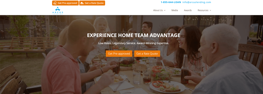
Arcus Lending is a smaller mortgage brokerage, but they have a very powerful website that is giving some of the bigger brokerages across the country a run for their money. They’ve packed in storytelling and features into their site to flex their thought leadership muscles and do it in a way that makes it easy for a potential borrower to see the advantages of doing business with them.
What They Are Doing Right
They’ve Got Integrated Verified Social Proof
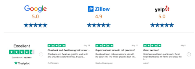
Compared to many other competitors in their industry, Arcus has doubled down on the importance of social media. They’ve integrated review count widgets from Google, Zillow and Yelp!, but also gone the extra mile to integrate actual reviews from TrustPilot. All these reviews are displayed prominently on their homepage, as well as other places strategically throughout their site.
They’ve Integrated An Easy To Use Preapproval Tool
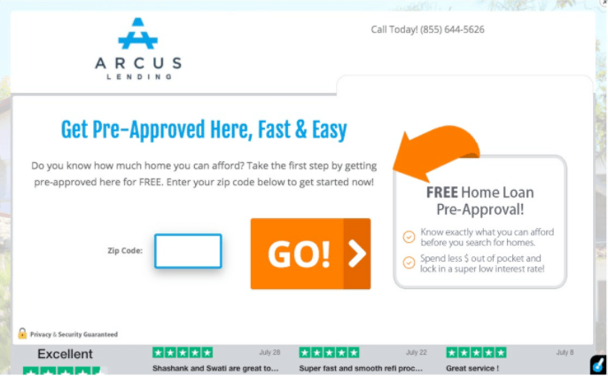
At first glance, it seems that Arcus is using LeadPops landing pages for their preapproval tool. While many might see that as a stand-alone option for preapprovals, the tech team at Arcus has come up with a fantastic way of framing it into their website to look integrated. Not only that, to hedge their bet and squeeze the most conversion possible out of the preapproval tool, they’ve embedded their TrustPilot reviews into the bottom of the page, helping them build trust with prospective borrowers before they even start filling out the preapproval form.
They Are Following The Hero’s Journey

Unlike many of their competitors, the team at Arcus has taken care to make sure they are following the hero’s journey on their website. Being a smaller, localized brokerage and touching people on a psychological level that makes them believe that Arcus is the leader in the space, it puts them in a prime position to generate a bigger pipeline of leads.
-They have a great integrated preapproval tool in the site (With TrustPilot data)
-They have a fairly close hero’s journey story script flow to their site and they excelled at breaking down a call to action with easy steps to get started
What Could Use Some Work
Their Communication Channels Are Limited
While their website follows best practices and they have phone and email contact options prominently displayed at the top of every page on their site, those are the only two communication channels available. As we mentioned before, different age categories of different borrowers prefer different communication channels. In order to maximize your conversion, you have to offer an array of communication channels that will cover every potential borrower’s preferences.
Their Blog Isn’t Hosted On Their Domain
The one feature on their site that hints towards Arcus being a small, localized brokerage is their blog. While their blog does have tons of great information on it for prospective borrowers, the blog is not hosted on their brokerage website. So when you click on the blog, you are taken to another website. To make matters worse, it doesn’t open that site in a new window but takes you away from Arcus’ website entirely and opens that blog in that same window.
First off, you never want to send people away from your website. Secondly, if you are going to take the time to put together such great content, you want to make sure that search engines are crediting your brokerage for that great content and listing your brokerage website in search engine results.
They Lack Lead Magnets
While we are on the topic of their blog, another lost opportunity we’ve found is the lack of lead magnets in their actual blog content. This is a missed opportunity. Their blog content looks great. It’s informative and value-added. A prospective borrower reading this content would most likely be willing to give their information to Arcus in exchange for some item of value. By not having lead magnets integrated into their blog content they are missing out on the full potential of online leads they can generate.
A Great Mortgage Website Is Never Done Evolving
Remember this: there is no perfect mortgage website. Take the best examples from these sites and get to work on incorporating them into your site. While your site may never be perfect, it can always be evolving and improving as times change. The better you can serve your clients and prospective borrowers, the more business you will be doing for years to come.
Key Takeaways
- Prioritize user experience on your mortgage website.
An easy-to-navigate site with a clear call-to-action helps visitors convert into leads.
- Incorporate essential features like mortgage calculators.
Providing tools like mortgage calculators enhances the user experience and keeps potential clients engaged.
- Optimize for SEO to drive organic traffic.
Proper SEO implementation ensures your website ranks higher in search results, attracting more clients.
Commonly Asked Questions
- What makes a mortgage website effective?
An effective mortgage website offers a user-friendly design, clear calls to action, and valuable content. It should be mobile-responsive, fast, and provide easy access to information about loan products, rates, and the application process.
- Why is having a well-designed website important for mortgage professionals?
A well-designed website serves as the first impression for potential clients and plays a significant role in converting visitors into leads. It acts as a reliable resource for information and builds credibility for mortgage professionals.
- How can mortgage websites improve lead generation?
Mortgage websites can improve lead generation by including interactive tools like loan calculators, contact forms, and clear calls to action. These features engage visitors and encourage them to take the next step, such as applying for a loan or scheduling a consultation.
- What role does content play in the effectiveness of a mortgage website?
Content is essential to educating potential clients, answering their questions, and providing them with valuable resources. Well-crafted content, such as blogs and FAQs, can help increase organic search traffic and position the lender as an expert in the field.
Your Site Can Look Like These Mortgage Website Examples